Gender Symbols & Pride Flags Explained: A Visual Guide for 2026
You’ve seen them everywhere: ♀ and ♂ on bathroom doors, rainbow stripes on company logos, yellow-purple-black flags in bios. These aren’t neutral science—they’re cultural shorthand. People invented them to sort bodies and identities fast.
For non-binary and gender-diverse folks, that shorthand often fails. Binary symbols don’t name us. But some new flags and glyphs do—so we can signal safety online, find each other IRL, and say “this is me” without a lecture.
This guide walks through 10 symbols and flags: where they came from, what the colours mean, and why they matter to the LGBTQIA+ community.
1. The Mars and Venus Symbols (♀ and ♂)
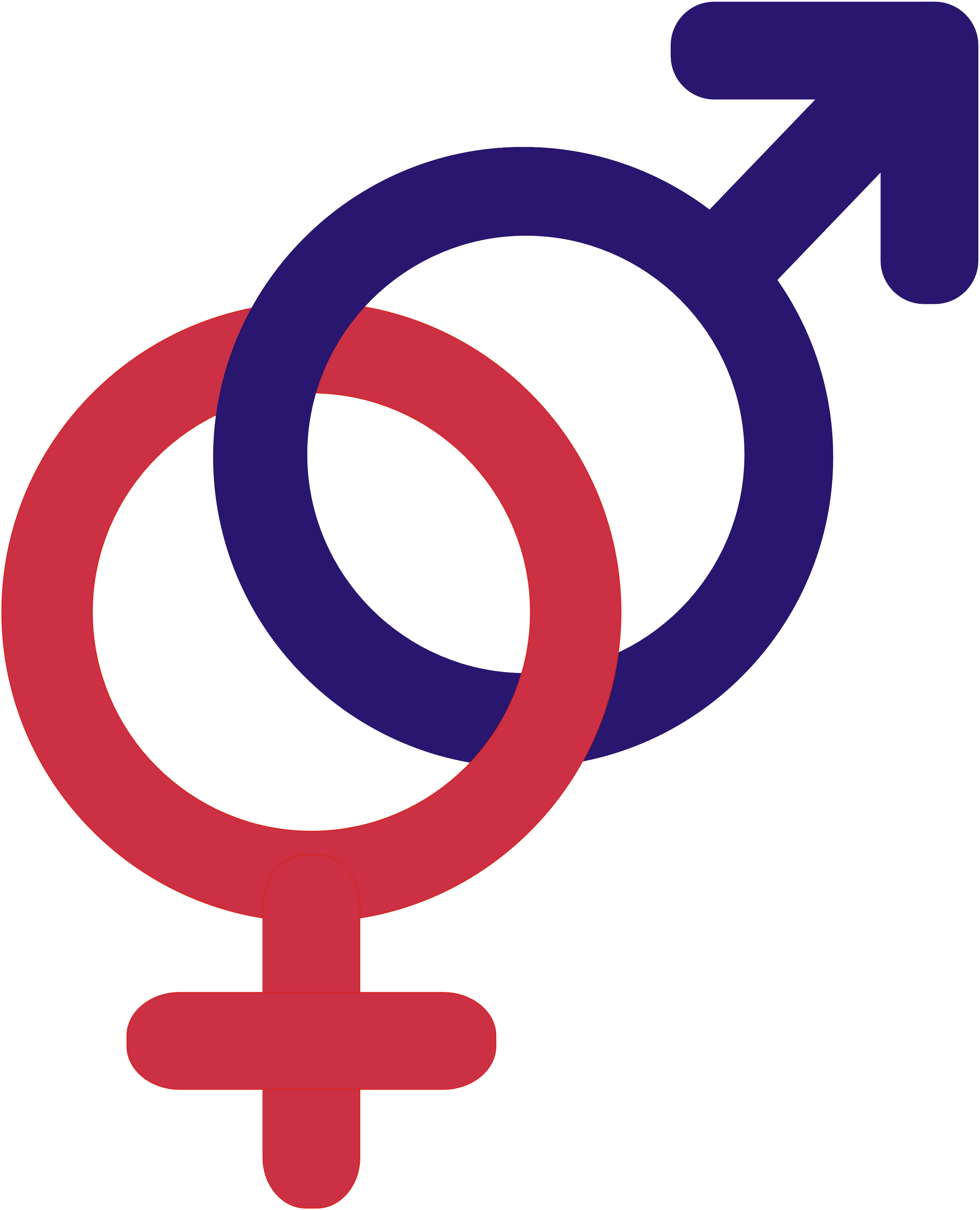
Look: Monochrome glyphs, circle + cross (♀), circle + arrow (♂)
Origin: Greco-Roman astrology; popularised in biology by Carl Linnaeus (1751)
Best for: Understanding default binary signage, and why many enbies look past it!
The female and male gender symbols you know from restrooms and medical forms didn’t start as “gender truth.” The circle-with-cross (♀) links to Venus (mirror); the circle-with-arrow (♂) links to Mars (shield and spear). Alchemists and astronomers used them for metals and planets long before your GP did.
It wasn’t until 1751 that botanist Carl Linnaeus borrowed them to mark plant “sexes” in compact notes. Humans later slapped the same marks on people. That history matters: gender symbols meaning here is a metaphor for convenience.
For enbies, unpacking ♀ and ♂ is freeing. They’re shortcuts from botany and astrology, NOT laws of nature. Once you see them as design choices, it’s easier to ask why we still treat them as the only options, and to reach for / reinvent symbols that actually fit.
2. The Non-Binary Pride Flag
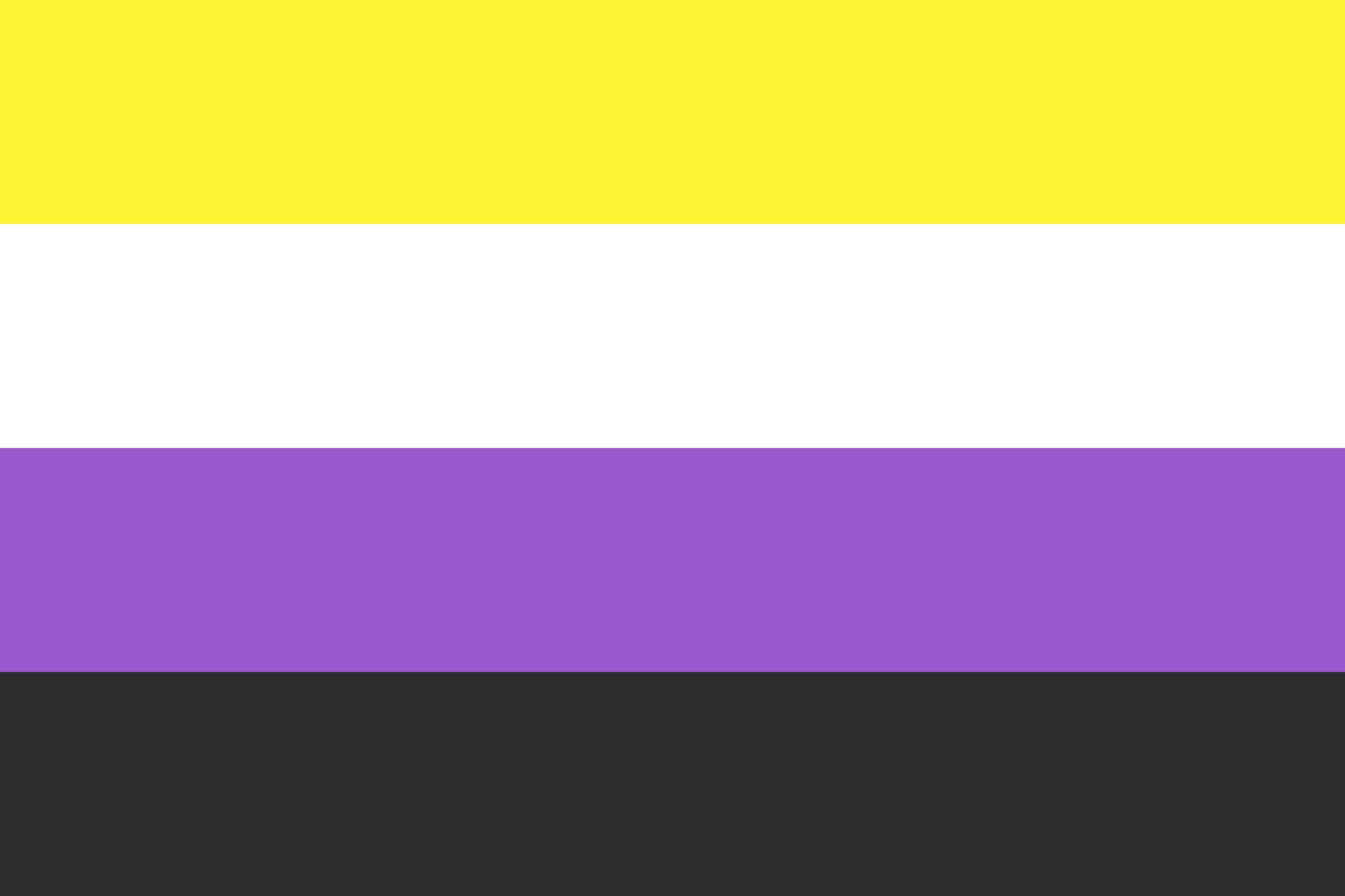
Colours: Yellow, white, purple, black
Created: Kye Rowan, February 2014 (age 17)
Best for: People whose gender sits outside—or moves around/between/through—the binary
The non-binary flag meaning starts with a teen who wanted a flag that wasn’t just a remix of older designs. Kye Rowan’s four-stripe flag gave non-binary people a dedicated banner that could fly beside (not inside) the genderqueer and trans flags.
Enby flag colours, stripe by stripe:
Yellow | #FFF433 for genders outside the male/female binary
White | #FFFFFF for many or all genders
Proposed Change (2024): “Cosmic Latte” | #FFF8E7 for all genders (Kye, we love this!!)
Purple | #9B59D0 for mixes or fluidity between binary poles
Black | #2D2D2D for agender and absent-gender experiences
If you’re new to pride flags explained as a whole, this one is the enby anchor—common in bios, pin packs, social posts, and protest lines. It doesn’t replace other identities; it names a shared umbrella: not man, not woman, not only either.
You might also like
3. The Transgender Pride Flag
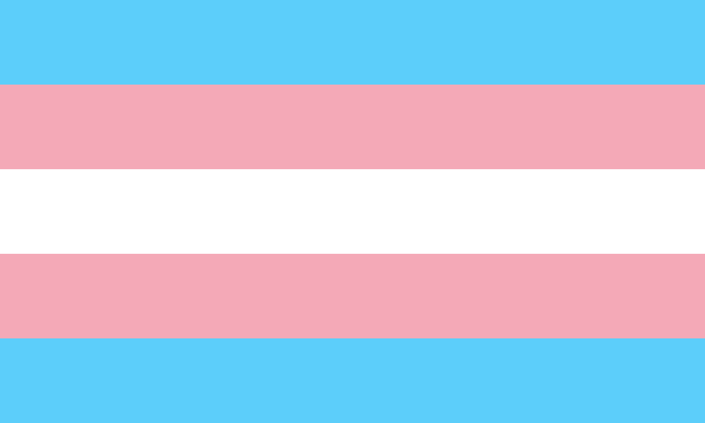
Colours: Light blue, pink, white (five stripes)
Created: Monica Helms, 1999
Best for: Trans people—including many enbies who identify as trans
Monica Helms designed a flag that looks correct no matter which way you fly it—symbolic of people seeking their own “right way up.” Stripes echo familiar “baby boy / baby girl” colours, with white for transition, neutrality, and intersex experiences.
Trans flag colours, stripe by stripe:
Baby Blue | #5BCFFB for stripes at the top and bottom, the traditional colour for baby boys
Baby Pink | #F5ABB9 for stripes under and above baby blue, the traditional colour for baby girls
White | #FFFFFF for those who are intersex, transitioning or consider themselves having a neutral or undefined gender, importantly representing all genders beyond the binary
Relationship to non-binary identity is nuanced. Some enbies identify as trans; some do not. Some use this flag daily; some prefer the non-binary or genderqueer banners. In Pride flags explained, the trans flag is still the bridge a lot of people recognise first—worth knowing even if it isn’t your personal patch. But for anyone who sits outside of cisgender binary identities, you have every right to connect with this flag as anyone else does.
4. The Progress Pride Flag
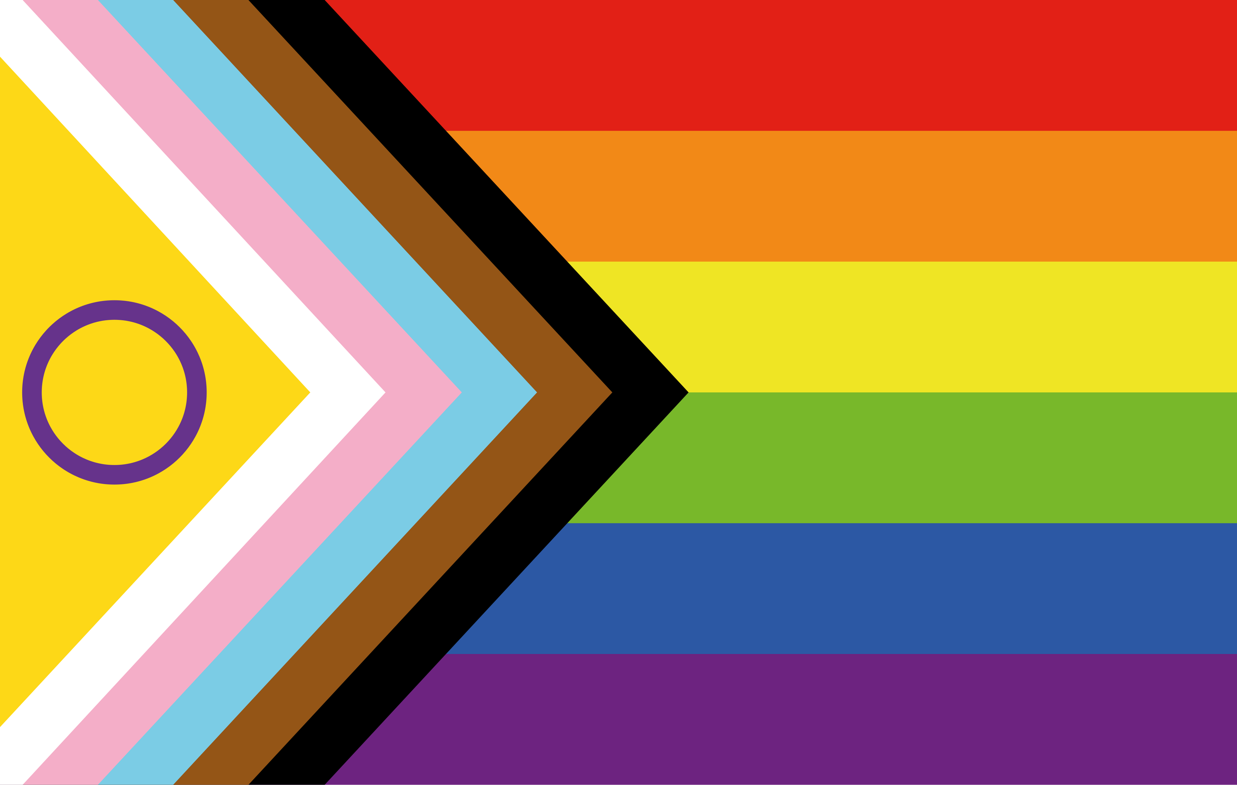
Colours: Six-stripe rainbow + hoist chevron (white, pink, light blue, brown, black) + intersex flag inclusivity
Created: Daniel Quasar (non-binary), 2018, original Progress Pride Flag; in 2021, Valentino Vecchietti redesigned to incorporate the intersex flag.
Best for: Signalling intersectional queer solidarity—not “rainbow only”
Quasar’s design folds in the trans flag and the Philadelphia “More Color, More Pride” chevron (2017). Marginalised stripes sit at the hoist so they’re literally in front when the flag flies. The arrow points forward, signifying progress still owed. The black stripe also honours Black and brown LGBTQ+ communities and those lost to or living with HIV/AIDS.
Progress Pride flag colours:
White | #FFFFFF for those who are intersex, transitioning or consider themselves having a neutral or undefined gender, importantly representing all genders beyond the binary
Baby Pink | #F5ABB9 for the inclusivity of transgender and gender diverse people who are often marginalised within LGBTQIA+ spaces
Baby Blue | #5BCFFB for the inclusivity of transgender and gender diverse people who are often marginalised within LGBTQIA+ spaces
Brown | #613915 for marginalised LGBTQIA+ folks, inclusive of Black, Brown, Indigenous, people of colour, and those who have been lost to or living with HIV/AIDS
Black | #000000 for marginalised LGBTQIA+ folks, inclusive of Black, Brown, Indigenous, people of colour, and those who have been lost to or living with HIV/AIDS
Red | #E50000 for Life
Orange | #FF8D00 for Healing
Yellow | #FFEE00 for Sunlight
Green | #028121 for Nature
Blue | #004CFF for Serenity
Violet/Purple | #760088 for Spirit
Vecchietti added a yellow triangle with a purple circle in it to the chevron of the Progress Pride Flag to incorporate intersex folks who too often are left out of representation even in LGBTQIA+ spaces. The redesign also changed the green colour to a lighter shade without adding new symbolism.
Intersex Inclusive Progress Pride flag colours:
Yellow | #FFD800 to represent the yellow on the intersex flag
Purple Circle | #7902AA to represent the “unbroken circle” on the intersex flag
Lighter Shade of Green | #78B82A
When brands slap up a generic rainbow, this version answers a community critique: visibility without centring those pushed to the edges isn’t enough.
Enby Meaning
Guides, analysis, and real talk on non-binary life — sent when it's worth sending.
We use Mailchimp. Privacy info.
5. The Genderqueer Pride Flag
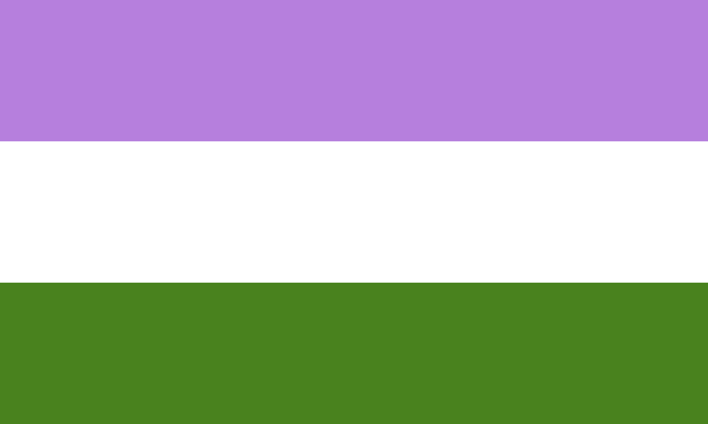
Colours: Lavender, white, chartreuse green
Created: Marilyn Roxie, June 2011
Best for: Non-normative, androgynous, and politically queer gender identities
Before “non-binary” was everywhere in mainstream feeds, many of us said genderqueer. Marilyn Roxie designed this three-stripe flag for the Genderqueer Identities community:
Lavender | #B57FDD for androgyny and queer histories
White | #FFFFFF for agender or neutral experiences
Chartreuse green | #49821E for identities outside the binary (lavender’s opposite on the colour wheel)
Overlap with “non-binary” is real; the words aren’t identical. Genderqueer often carries a sharper anti-normative edge. Seeing both flags in the wild helps make sense of gender symbols’ meanings: communities iterate on visuals when language shifts.
6. The Agender Pride Flag
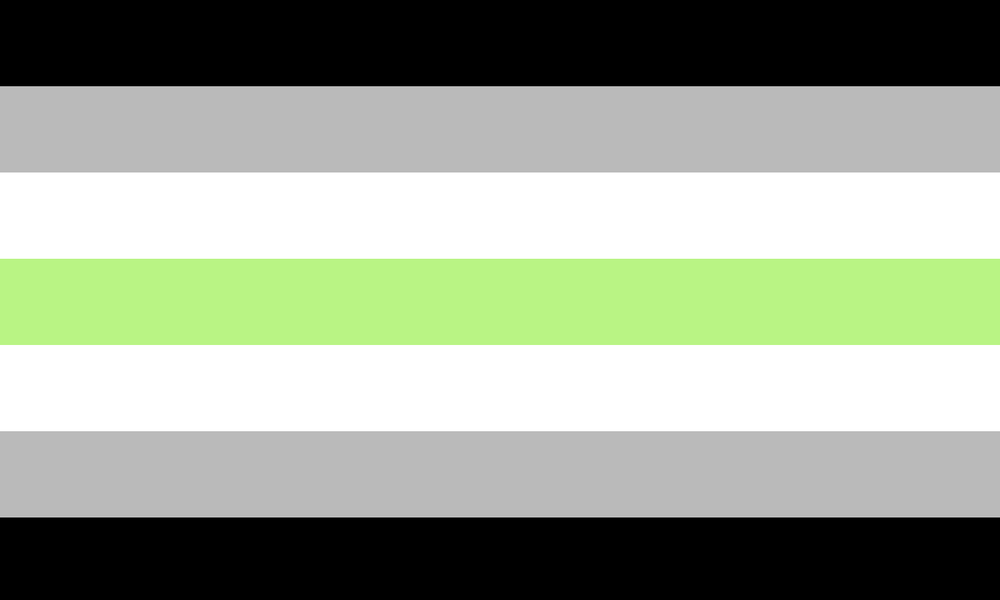
Colours: Black, grey, white, green (symmetrical seven stripes)
Created: Salem X (“Ska”), 18 February 2014
Best for: Agender people and those with little or no gender attachment
Salem built a mirrored layout echoing Monica Helms’s trans flag—on purpose.
Stripes read from the outside in:
Black | #000000 for absence of gender
Grey | #BABABA for semi-genderless or liminal space
White | #FFFFFF for neutral experiences
Green | #BAF484 for non-binary genders (inverse of purple on other flags)
Agender isn’t “empty.” For a lot of us, it’s a complete identity—not a pause before picking a side. This flag made Tumblr-era agender folks visible in the same burst of 2014 design energy as the non-binary banner.
7. The Genderfluid Pride Flag
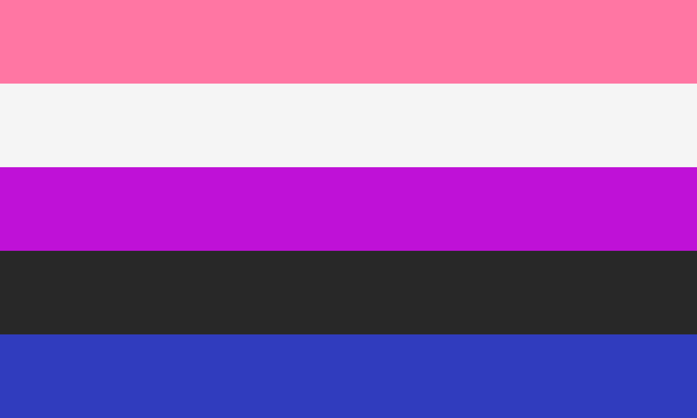
Colours: Pink, white, purple, black, blue (five stripes)
Created: JJ Poole, 2011
Best for: People whose gender shifts over time
Fluidity isn’t indecision—it’s data. The flag represents the fluidity inherent in the identity.
Poole’s flag names movement between expressions:
Pink | #FE76A2 for femininity
White | #FFFFFF for lack of gender
Purple | #BF12D7 for both or in-between, androgyny
Black | #000000 for all genders, including those outside the binary
Blue | #303CBE for masculinity
If you’ve ever felt fake because your gender “changed,” this visual is the counter-argument: fluctuation can be real, valid, and worth signalling.
8. The Intersex Pride Flag
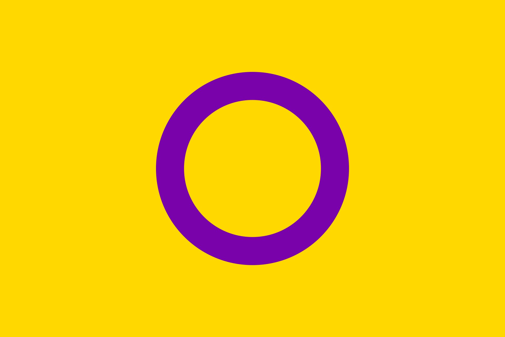
Colours: Purple circle on yellow field (unbroken circle)
Created: Morgan Carpenter, 2013 (Intersex Human Rights Australia)
Best for: Intersex people—and allies learning bodily autonomy politics
Carpenter wanted a symbol that wasn’t a rainbow remix and didn’t reuse ♀/♂.
Colours, shapes, and meaning:
Yellow | #FFD800 was picked as a colour with weak stereotypical gender baggage
Purple Circle | #7902AA (the unbroken circle) stands for wholeness—pushing back on surgeries and shame pushed on intersex kids
Intersex ≠ non-binary. Intersex refers to sex characteristics; non-binary refers to gender identity. Plenty of people are both; plenty are only one. Enby communities still lift this flag because it rejects binary sorting of bodies—the same instinct behind many enby flag colours and glyphs: you don’t need to be “fixed” to be whole.
You might also like
9. Two-Spirit Flag
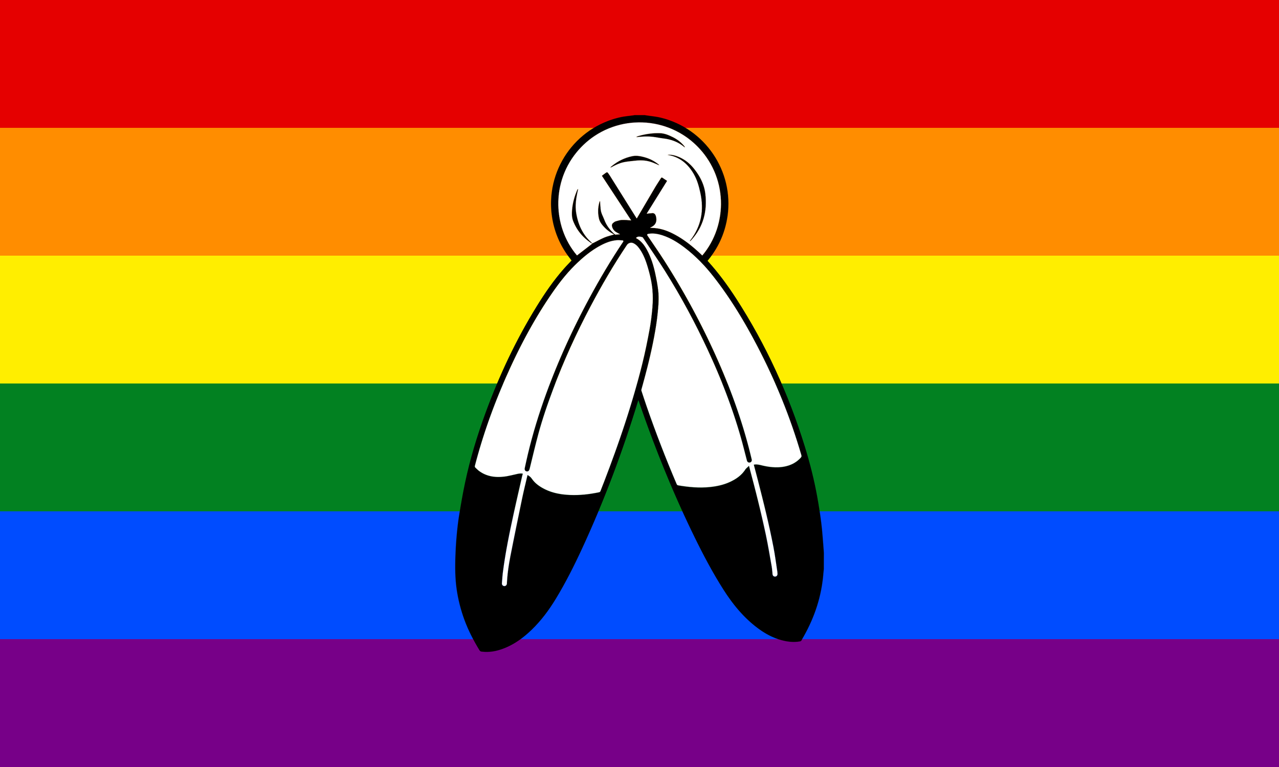
Form: Culture-specific roles and language—not a universal pride flag
Origin: English term Two-Spirit introduced at a 1990 Winnipeg gathering (Dr Myra Laramee, Cree); builds on Indigenous concepts like niizh manidoowag (Anishinaabemowin)
Best for: Learning respectfully—not for non-Indigenous people to claim
Two-Spirit refers to sacred, community-specific roles in which masculine and feminine spirits coexist in one person—roles that colonialism and Christianity disrupted. Before forced binary gender systems, Two-Spirit people often held leadership as healers, teachers, and tradition keepers.
This belongs in a Pride flags explained guide only with clarity: Two-Spirit is not an identity non-Indigenous LGBTQ+ people can adopt. It isn’t merch. It isn’t a stripe set to add to your pin collection. Non-Indigenous enbies can honour Two-Spirit relatives by listening, citing Indigenous writers, and not treating Indigeneity as aesthetic.
If you’re Indigenous and Two-Spirit resonates with you, that’s between you and your community—not a trend chart.
10. The Gender Neutral Flag
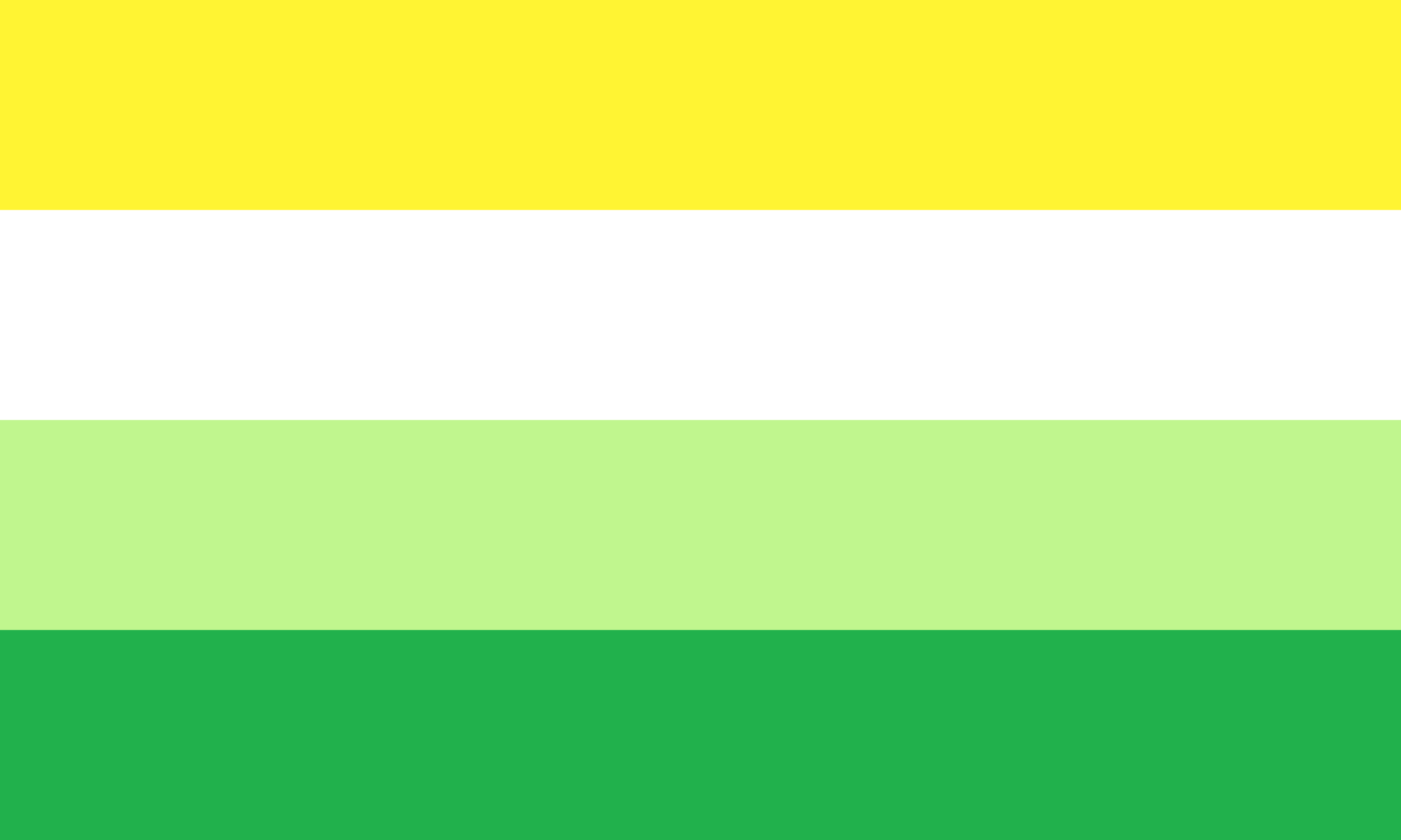
Colours: Yellow, white, and two shades of green
Created: DeviantArt user enbygsrd around 2016
Best for: Agender people and those with little or no gender attachment
Stripes read from the outside in:
Yellow | #FFF433 for genders outside the male/female binary
White | #FFFFFF for neutral experiences
Light Green | #BAF484 for non-binary genders (inverse of purple on other flags)
Green | #028121 commonly associated with neutrois and other neutral genders
Gender-neutral often describes a presentation that isn't strongly associated with either men or women. This usually means showing traits commonly associated with both genders, without leaning heavily towards either. Since ideas of neutrality can be different across cultures and eras, what feels neutral can vary.
It's also important to note that not everyone who presents as gender-neutral identifies as having a neutral gender, and people of any gender or sexual orientation can choose to present this way. Those with a neutral gender or presentation might be called transneutral. Sometimes, people use 'neutral' and 'androgynous' interchangeably, but they actually mean different things. The "Neutral" here refers to something that isn’t strongly masculine or feminine, while "androgynous" describes a mix of both masculine and feminine qualities at the same time.
The gender-neutral flag aims to provide greater representation and understanding for the people who align with this identity.
Bonus! #11 Community-Created Symbols (⚧ and Beyond)
Form: Typography and hybrid glyphs (⚧, non-binary “X,” neutrois/comet motifs, and more)
Created: Various artists and communities (1970s–2010s)
Best for: Neutral markers when flags are too big—or too binary
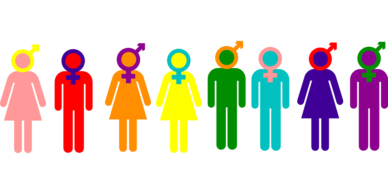
The transgender symbol ⚧ combines ♀, ♂, and ⚦. It’s widely known—and for some enbies, still feels like a merger of two poles we don’t occupy.
Community responses include Johnathan R.’s non-binary “X” (2012)—a stem with an X or a star that refuses to “pick a direction.” Others borrow neutral glyphs from alchemy or astronomy (e.g. comet symbols for neutrois/agender vibes). These aren’t uniform standards; they’re shared hacks that spread because they work in bios, jewellery, and zines.
Glyphs matter offline too: pins on a lanyard, a tattoo, a subtle earring can keep you safer than a speech. They can also feel performative when corporations paste ⚧ on products without funding trans healthcare.
Same symbol, very different contexts.
Which symbol or flag do you actually use?
Flags and glyphs are tools. They help us find each other and refuse erasure. They’re also having a corporate moment—rainbow gradients on ads that never mention non-binary healthcare or housing.
We’re not here to police your pin collection. We are here to say: the ones you fly in private, in group chat, at Pride—those usually carry different weight than the ones brands deploy for a month.
Which symbol or flag do you actually use — and which ones feel performative? Drop it in the comments: what you wear daily, what you side-eye, and what you wish more people understood before they reposted it.
Enjoyed this read?
Subscribe for more, or explore posts connected to this one below.